导读:苹果新闻应用换了新标志,可在Dota2玩家眼中,两个标志却是似曾相识,乍看之下二者竟是惊人地相似!
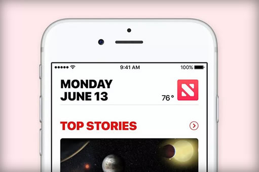
It’s not unusual for Dota 2 fanatics like myself to perceive the game’s logo in innocuous everyday objects, but when it comes to the new Apple News logo, I think even laypeople will have to agree that it bears a striking resemblance. Both marks feature a square bisected by a diagonal line descending from left to right. Both have a pair of rough triangles filling the open corners. Both are red!
对于笔者这样的Dota 2发烧友来说,在日常生活中看到这款游戏的标志可说非比寻常。不过看了苹果新闻的新标志,一般人都会觉得二者确实“撞脸”了:两个标志的外观都为正方形,通体呈红色,中间是一条由左至右的对角线,两侧空白部分各有个三角形图案。
Now, I’m not about to suggest that Apple copied Valve’s global sensation of a video game. As I say, those of us who play Dota are stupidly passionate about it and we’d notice an infraction of this kind pretty much instantly. Much more likely is that Apple simply didn’t know. I guess 12 million active players each month, millions of Twitch viewers, and tournament prizes that overshadow pro sports aren’t quite enough for Dota to register on Apple’s radar. It’s mind-boggling to me, but seriously, Apple works on a scale of billions, not millions, and it’s not like the company has ever shown itself particularly interested in PC gaming. Which is a shame because my dream computer is basically a MacBook that can run all my Steam games as well as a Windows PC.
笔者的意思不是苹果复制了Valve公司出品的游戏的标志。笔者说过,像我们这样无法自拔的Dota玩家,对如此违和的图案及其敏感。苹果公司对此可能毫不知情。笔者想,即便Dota2每个月有1200万活跃玩家,Twitch上的观众达到数百万之多,比赛奖金令传统体育相形见绌,恐怕也难入苹果的法眼。对此笔者简直无法想象,说真的,Dota的产业规模达到百万美元级已经相当难得,可苹果的生意动辄便是数十亿美元,而苹果从未对电脑游戏表现出特别的兴趣。说到这里,笔者心头一痛,拥有一台能像个人电脑一样流畅运行Steam上游戏的MacBook素来是笔者的梦想。
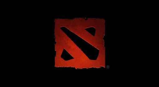
The inspiration for the two logos is rather divergent. Apple’s News app is going for a stylized "N" whereas the Dota 2 mark is a representation of the one and only map on which the game is played: the diagonal represents the river splitting the Dire and Radiant sections and the corner elements are the bases that each team has to defend (the "Ancients" in the original Defense of the Ancients game title).
两个标志的设计灵感可谓截然不同。苹果新闻的标志代表大写字母“N”,而Dota2的标志代表游戏地图:中间的对角线其实是天灾军团和近卫军团的分界河,角落里的图案则代表双方各自的基地(Dota1中的字母A代表上古遗迹)。
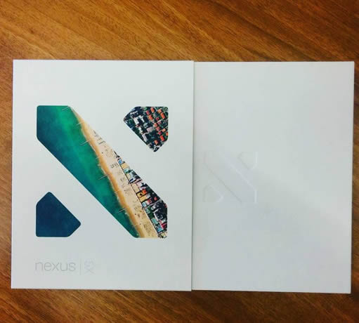
Lest you think that Apple is uniquely ignorant of PC gaming, though, Google didn’t do much better with its Nexus 5X last year, whose packaging looked like this:
苹果不怎么关注电脑游戏,谷歌也好不到哪里去,谷歌去年推出的Nexus 5X的包装是这个样子的:
Actually, that 5X box looks almost exactly identical to Apple’s new News. So maybe my Dota bias has swayed me to focus on the wrong similarity.
实际上,5X盒子的包装看上去与苹果新闻的新标志几乎一模一样。笔者可能对Dota过于偏爱,才会关注这样几个标志之间无甚关联的相似性。


